
Creating a balanced and visually pleasing home begins with choosing the right color palette. Colors influence mood, perception of space, and the overall character of interiors. A thoughtfully coordinated palette can transform ordinary rooms into welcoming, cohesive environments that feel both intentional and comfortable.
This guide explores practical, stylish, and adaptable color palette ideas that help homeowners design spaces that feel calm, modern, and naturally connected.
Why a Harmonious Color Palette Matters
A harmonious palette ensures that every room flows naturally into the next. Instead of feeling disconnected, the home develops a unified identity that supports relaxation and visual comfort.
Benefits include:
- Improved sense of spatial continuity
- Enhanced natural lighting effects
- Stronger design personality
- Easier coordination of furniture and décor
- Reduced visual clutter and overstimulation
Choosing colors strategically helps create a home that feels balanced rather than busy.
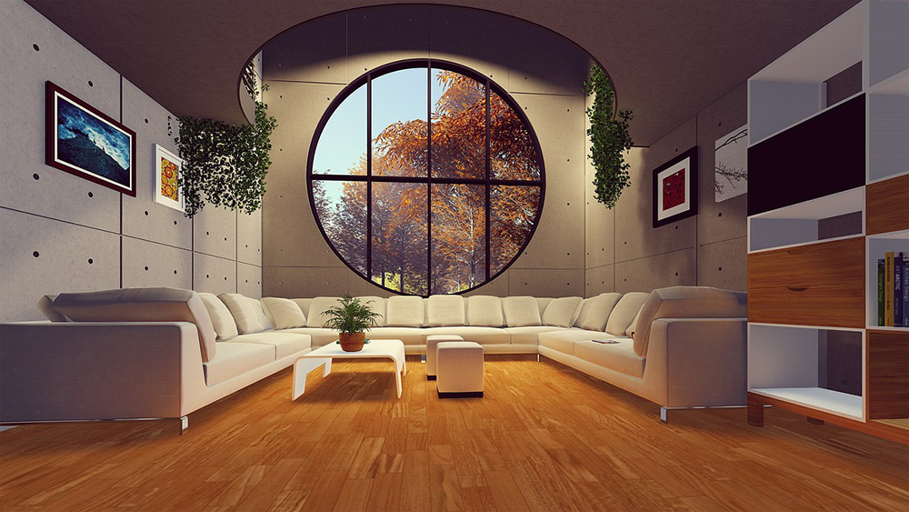
Neutral Foundations with Warm Undertones
Neutral palettes remain one of the most reliable ways to create harmony throughout a home. Warm neutrals provide comfort without appearing plain.
Popular combinations include:
- Soft beige + warm white
- Cream + taupe
- Light greige + wood textures
- Sand tones + muted gold accents
These tones reflect light beautifully and allow furniture, artwork, and textiles to stand out naturally.
Best suited for:
- Living rooms
- Bedrooms
- Entryways
- Open-plan layouts
They create a calming base that works across nearly all design styles.
Earth-Inspired Natural Palettes
Nature-inspired palettes are growing increasingly popular because they create grounding and relaxing environments.
Common earthy combinations include:
- Olive green + clay terracotta
- Warm brown + moss green
- Sandstone + muted rust
- Forest green + cream
These palettes work especially well when paired with natural materials like:
- Wood
- Linen
- Stone
- Rattan
They create interiors that feel timeless rather than trend-driven.
Soft Pastel Harmony for Light and Airy Interiors
Pastels bring brightness without overwhelming the senses. They help smaller rooms feel open and welcoming.
Balanced pastel pairings include:
- Blush pink + dove grey
- Mint green + soft white
- Powder blue + cream
- Lavender + warm beige
These palettes are ideal for:
- Bedrooms
- Nurseries
- Reading corners
- Compact apartments
They introduce gentle color while maintaining elegance.
Monochromatic Elegance for Modern Homes
A monochromatic palette uses different shades of one color to create depth and sophistication.
Example palettes include:
- Charcoal + ash grey + silver
- Ivory + cream + soft white
- Slate blue + steel blue + navy
The key to success with monochromatic interiors is layering textures such as:
- Fabric
- Wood
- Metal
- Rugs
Texture prevents the space from appearing flat.
Coastal Calm with Blue and Sandy Tones
Coastal palettes evoke freshness and openness without needing a seaside location.
Classic combinations include:
- Soft blue + white
- Aqua + driftwood beige
- Sky blue + light grey
- Seafoam + sand
These palettes reflect natural light effectively and create peaceful living environments.
Jewel-Tone Accents for Rich Visual Contrast
Jewel tones add personality and drama when used thoughtfully alongside neutral bases.
Effective accent pairings include:
- Emerald + cream
- Navy + brass
- Burgundy + taupe
- Sapphire + warm grey
Rather than overwhelming a space, jewel tones work best through:
- Accent walls
- Cushions
- Curtains
- Upholstery
They introduce luxury without sacrificing harmony.
Tips for Creating a Balanced Home Color Scheme
A harmonious palette depends on thoughtful layering rather than random color selection.
Helpful design strategies include:
- Choose one dominant base color
- Add two supporting shades
- Introduce one accent tone
- Maintain consistent undertones across rooms
- Test colors under natural and artificial lighting
- Repeat colors subtly across spaces for continuity
Consistency is more important than complexity.
How Lighting Influences Color Harmony
Lighting dramatically affects how colors appear inside a home.
Consider these adjustments:
- North-facing rooms benefit from warm tones
- South-facing rooms handle cooler tones well
- Artificial lighting may deepen darker shades
- Matte finishes soften reflections
- Gloss finishes intensify brightness
Testing paint samples before committing prevents mismatched results.
Room-by-Room Palette Planning Strategy
Instead of choosing colors randomly, plan transitions between rooms.
Example flow approach:
- Entryway → warm neutral
- Living room → earthy accent palette
- Kitchen → light pastel freshness
- Bedroom → calming monochrome tones
This keeps the entire house visually connected while allowing variety.
FAQ
1. How many colors should a home palette include?
A balanced palette usually includes one main color, two supporting shades, and one accent tone for contrast.
2. Can dark colors still create harmony in small rooms?
Yes. When paired with lighter trims and reflective surfaces, darker tones can make small rooms feel cozy rather than cramped.
3. Should every room use the same wall color?
Not necessarily. Instead, maintain shared undertones so transitions between rooms feel natural.
4. What is the easiest palette for beginners?
Warm neutrals combined with soft accent colors are the simplest and most adaptable starting point.
5. How do I match furniture with wall colors?
Choose furniture either slightly darker than the wall color for contrast or in complementary undertones for cohesion.
6. Are accent walls still a good idea in modern interiors?
Yes. Accent walls remain effective when used sparingly and paired with balanced surrounding colors.
7. How often should a home color palette be updated?
Most palettes remain visually relevant for 5–8 years if built around timeless base tones rather than short-lived trends.
Comments are closed.